Visualizing the Patient Experience:
How meaningful illustrations deliver unmatched impact
As users endlessly scroll through their news feeds and daily news round-ups, it’s rare that poignant, unique illustrations catch the eye and even rarer for those images to accompany content that speaks directly to a personally relatable health experience. That was Chief eXperience Officer Blake Harris’s vision when he joined Health Union in 2011–to communicate understanding, and validation to millions of people impacted by chronic conditions in the best way he could: through unique, handcrafted illustrations.
In this Q&A, Harris, who now oversees an entire creative team who creates unique illustrations every day for each of Health Union’s 20 online health communities (and growing), reveals what it took to accomplish his creative vision that continuously maintains a laser focus on the patient experience.

J. Blake Harris, Chief eXperience Officer at Health Union
Tell us a little about your background. What attracted you to Health Union?
I worked in the advertising world for many years, most recently as a Creative Director. In later years, most of my clients were from the pharma world. It was a very different experience, compared to my previous work with clients in hospitality and consumer goods.
In pharma, creating exceptional work is often a challenge. Copy and messaging require exhausting legal and regulatory reviews and health is a sensitive subject.
But there is also the opportunity to reach people in need of help – and that’s what appealed to me about Health Union. Seeing the realities of people living with serious health conditions, and building campaigns designed to help them find their way to a resolution of some kind was certainly more rewarding than anything I had done before.
When I learned about Health Union and the vision for the company they were building, it seemed like the perfect opportunity to take what we had been doing at the agency to an entirely new level. It was a new company with a unique business model, which I thought was pretty exciting.
What was the vision you wanted to accomplish creatively for Health Union and how does that align with where we are today?
Any invested designer lives for a new branding opportunity, and this was no exception. Creating an identity for Health Union, and mapping out how our communities would be branded was, and continues to be, truly rewarding work.
As our first community, Migraine.com, started to grow, what felt most important about our identity was authenticity. We needed to communicate understanding and help people realize they aren’t alone when faced with chronic illness. Listening to, reading about, and truly understanding people in our community was necessary before considering even small design concerns. This continues to be the case for every community we’ve launched.
Overall, most health-related branding tends to be generic. I think our focus on authenticity not only makes our online health communities more visually interesting but also much more relatable.
We have never treated Health Union as a single brand–and each new community brings new challenges, but these challenges lead to new learning, new ideas, and stronger identities for every community.
How would you describe Health Union’s visual brand? What are the hallmarks of our visual style that makes it distinct?
What’s most important visually is that people can relate and find what they want. To do so, we always consider the context, which often means keeping logos and other standard branding elements to a minimum. No one likes being beat over the head with a logo, especially if it is an obstacle to reading a story, or otherwise engaging with the community on a page.
Where our branding has really expanded beyond the basics is with original illustrations that accompany articles and other content on our sites. There is a distinctive tone to the imagery we use across our communities, and they have increasingly become a part of our visual identity. Contextually, they are usually more appropriate.
The artwork that accompanies much of the sites’ content feels personal and emotional. How do you ensure visual synergy across sites when the patient experience across conditions can be so different?
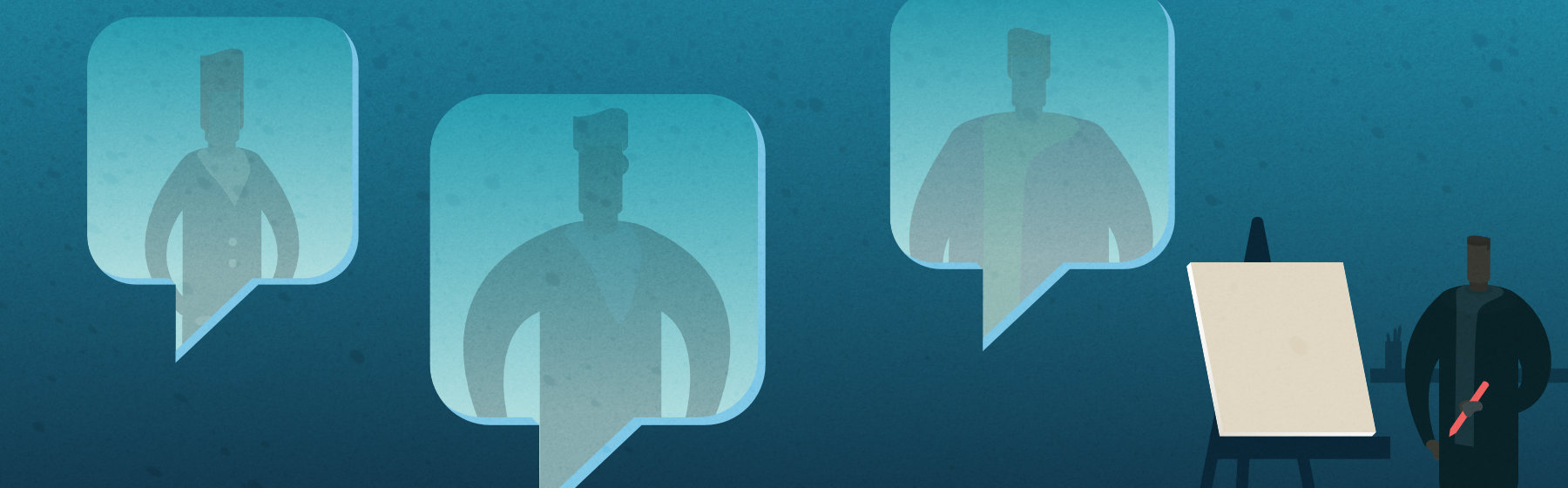
Illustration for an article on ParkinsonsDisease.net by the Health Union UX team.
Obviously, the most important part is finding designers who understand what we are trying to accomplish–providing people with information, support, and validation in these online health communities. We have a very talented UX team.
Our communities are all very unique, so as our UX team has grown, we’ve created design lead positions for each one. Many of our designers gravitated towards communities that were relevant to them. And every designer’s job responsibilities include taking time to understand the community: read every article, visit the social media pages, read through comments.
Early on, we recognized that photography would not be a great fit for us in most situations. Illustration, on the other hand, would provide us with the freedom to express concepts that aren’t easily recreated in a photograph, and that is always relevant to the content. They’ve also helped us solidify our visual identity. Every new illustration we produce contributes towards something that is recognizably Health Union and creates a relevant connection to our communities because it shows we understand their journey.
Health Union’s online health communities aim to help people living with chronic conditions find information, connection and validation. What role do you think the imagery and visuals play in that mission?
Each of the articles we publish aims to help people – even in small ways – deal with a health condition. Our UX team believes every illustration should be a visual representation of the story, not just another reflection of the condition. This typically involves illustrating something new.
Visitors might not take the time to read the entire article, but if the image captures the story, hopefully they’ve recognized something they can relate to, and the informative and validating aspects of the story are communicated regardless.
Can you give us an example of something you’re particularly proud of?
I’m really proud of the UX team we’ve built. They are some of the most talented people I’ve ever worked with, and I’ve worked with a lot of people. I love seeing their contributions reflected in the visual identities of our communities, and how those contributions have evolved those identities.
I’m also proud of this company for staying true to our mission, insisting on excellence, yet creating a place where ‘family’ isn’t just an empty word.
Thinking about content marketing in the pharma or healthcare space, how do you think Health Union’s visualization of the patient experience differentiates us?
One of my favorite headlines from an ad we created for Migraine.com was “There’s more to migraine than migraine.” I think it really spells out what differentiates us. The intent at Health Union was never to simply put health information out there. It’s not very helpful if you don’t also account for the impact of having a health condition, or help people manage life while dealing with that impact. Almost everything in our lives contributes to our health in some ways. What is often overlooked is that those same circumstances also determine how we will manage our health, or respond to a health problem. We’ve found those conversations to be much more helpful for people in our communities.
Stay up-to-date with the latest UX designs across Health Union’s communities.
Follow @healthunion_ux on Instagram today!

